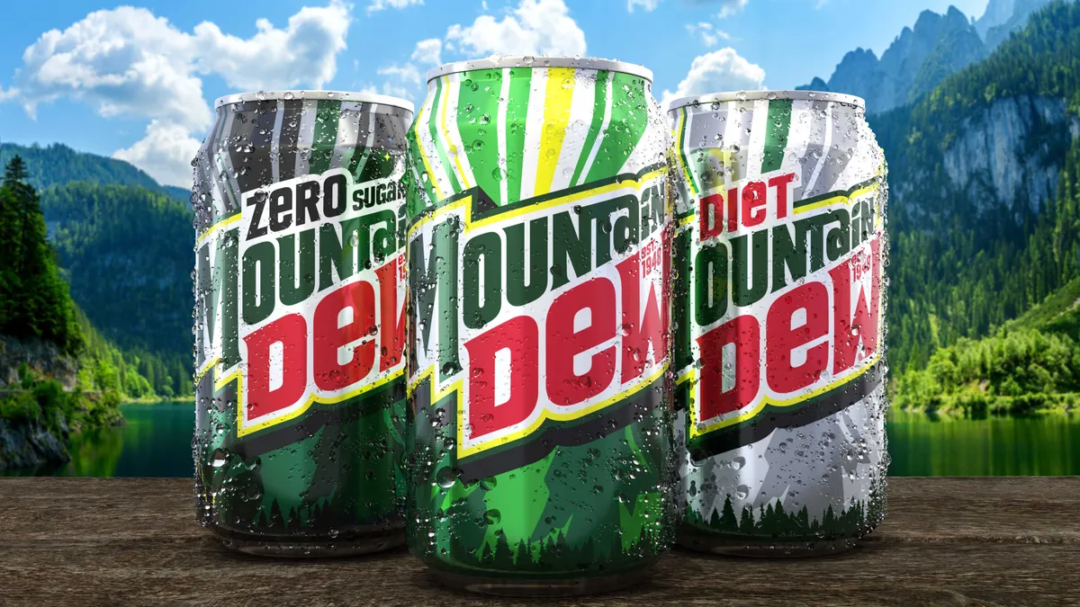
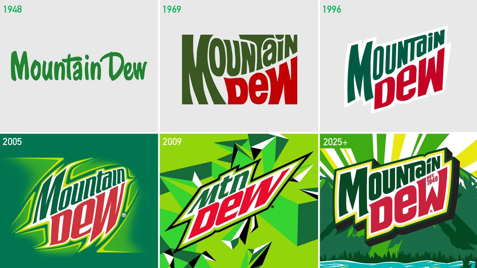
Mountain Dew is returning to the mountains with a revamped visual identity, according to information shared with Marketing Dive. A new logo includes the brand’s eponymous topography, along with a retro, three-dimensional font that spells out the soft drink’s full name rather than the abbreviated “Mtn Dew” moniker that has been in use for more than a decade.
The overhaul aims to tap into Mountain Dew’s citrus-flavored refreshment while celebrating the great outdoors and good times with friends. The look will roll out in the U.S. starting next summer across all brand touchpoints, including packaging, equipment, advertisements and experiences.
“Nothing is more powerful than how you show up on shelf and how you talk about the brand from a logo and iconography system,” said JP Bittencourt, vice president of marketing at Mountain Dew. “As we took stock of where we were, we really felt it was important to do a refresh and make a meaningful change on our visual identity system.”
The move follows recent marketing efforts that reinvigorated Mountain Dew’s iconic tagline (“Do The Dew”), introduced a new brand character (the Mountain Dude) and claimed the Mountain Time Zone as the company’s own. Mountain Dew is enacting a larger shift away from an individualistic, extreme positioning toward a more ownable space around “energizing refreshment,” according to Bittencourt.
“As our consumers evolve, we want to evolve with them,” the executive said in emailed comments. “Mountain Dew is an iconic brand that people associate with memories of having fun with friends, so it’s important to make sure our look and feel resonates with our fans and that we continue to drive this message home.”
Leveraging an in-house team
Designed by the in-house PepsiCo Design & Innovation team, Mountain Dew’s new logo has soft angles and citrus-inspired yellow hues that connect the soda’s color to sunshine. It also includes the year the brand was established, 1948, and adds a citrus leaf icon over the “i” in the spelled-out “Mountain.” The typography is reminiscent of the fonts used in the ‘80s and ‘90s, in a nod to the brand’s heritage, said Mauro Porcini, senior vice president and chief design officer at PepsiCo.
“We’re celebrating the most authentic expression of the brand, but then trying to project this brand also towards the future,” Porcini said. “It’s a brand that lives in the present that needs to be relevant in the future for our consumers.”
The color palette also includes “energetic” greens and red. Each flavor and limited-edition offering of Mountain Dew will feature its own outdoor landscape and palette as the branding becomes “a wonderful canvas for storytelling,” Porcini explained.
“Every time we design any brand, we don’t consider just the beauty and functionality of the design on a static piece of packaging,” Porcini said. “We always think about how that piece of packaging can be the catalyst of storytelling that transcends packaging completely and touches every touchpoint of the brand, both physical and digital.”
PepsiCo’s in-house team includes a mix of veterans and newcomers to both the brand and industry, allowing the group to tap into both historical knowledge and fresh perspectives. In that way, PepsiCo works to side step the pitfalls sometimes associated with in-housing.
“The in-house cross-functional team has a profound understanding of our brands, consumers, business model, and culture, built over years of practice and projects, including missteps and successes,” Porcini said in emailed comments. “When we work on a project we leverage and unleash all that expertise, driving higher quality with greater agility and effectiveness.”
Mountain Dew’s makeover follows a similar rebrand for Pepsi last year that moved the soda away from minimalism to embrace a more colorful, maximalist design scheme.


