Dive Brief:
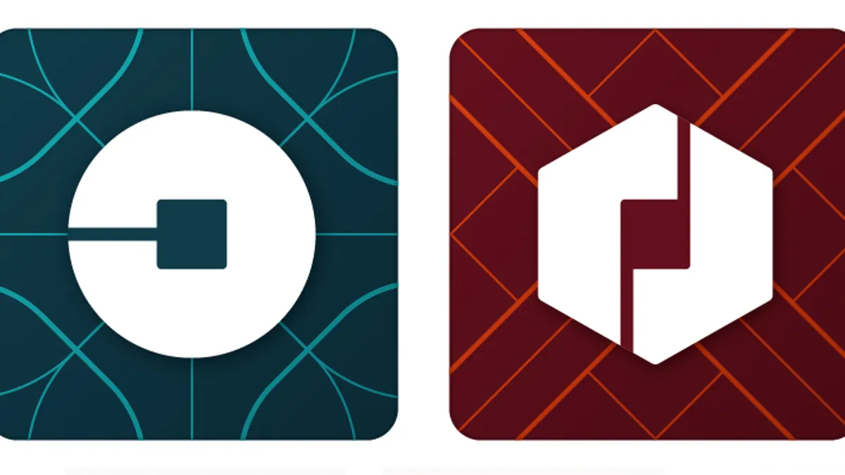
- Uber has a new look, leaving behind its familiar "U" and replacing it with what looks like a backwards "C," as part of a rebranding move.
- The change also gives riders a blue icon and drivers a red one in the U.S., and other colors for other countries where Uber operates. The rebranding extends to the app itself with animations, new illustrations and guidelines for photography.
- The rebranding is part of a process of Uber redefining itself and transforming its purpose now that it has become a global brand, according to an Uber blog post on the news.
Dive Insight:
Founded as "UberCab" in 2009, Uber is now a global brand in 400 cities across 68 countries, with a market valuation close to $65 billion. Uber was driven to rebrand because it is "fundamentally different company" today than when it first started and got its look.
"Uber began life as a black car service for 100 friends in San Francisco—everyone’s private driver," Kalanick wrote about the logo change in a blog post. "Today, we’re a transportation network spanning 400 cities in 68 countries that delivers food and packages, as well as people, all at the push of a button. And thanks to services like uberX and uberPOOL we’ve gone from a luxury, to an affordable luxury, to an everyday transportation option for millions of people."
Today, Uber is not just a ride-hailing company, but a technology company, which the new logo celebrates, he explained.
One aspect of Uber’s rebranding that’s unorthodox is that Kalanick was very hands-on during the rebranding process, working with Uber’s design director, Shalin Amin, and a small team. Even though the process goes against the more typical rebranding executed by external experts, it shouldn’t be too surprising given that Kalanick is a very engaged founder. Kalanick pointed out to Wired that the new look and feel for Uber came from a place of starting to "know who you are."
Public response to the rebrand has been mixed at best, with many critical of the new logo in particular. See below for some notable responses on Twitter:
The only thing I can't see in the logo is what I need to see "U" for Uber. https://t.co/U2yzlhO7rN
— Om Malik (@om) February 2, 2016
Dear Uber: your old logo was very bad but useful. Your new logo is very bad and useless. Yours truly, Everyone. pic.twitter.com/uWHgJcSbm4
— Joshua Topolsky (@joshuatopolsky) February 3, 2016
How to spot an @uber investor: search Uber on twitter and look for people saying nice things about their rebrand.
— Lauren Sherman (@LaurenSherman) February 3, 2016


