Widen Enterprises Color Manager Mark Pajari has had a love affair with hues for over 25 years. Starting with roots in graphic design and photography, Pajari moved into the corporate world when he was hired for a position at printing company Quad Graphics in Wisconsin. Since then, Paraji has spent his time studying the psychology of color and sharing what he has learned with employees at the various companies he has worked for.
Recently, social media management platform HootSuite changed from a bright, multicolored scheme to a sleeker look. Its logo and mascot, “Owly,” went from being a cartoonish bird to a simpler black-and-white owl.
According to Pajari, the logo change followed one of the key rules of image and color marketing: KISS, or “Keep it simple, stupid.” The cleaner logo portrays an image of simplicity — something HootSuite likely wants reflected in its brand. The black-and-white logo is also easier to reproduce.
The discussion of HootSuite’s makeover spawned a larger discussion on the power of color in marketing, as Pajari explained how the following eight colors influence human response in marketing and branding.
1. Red
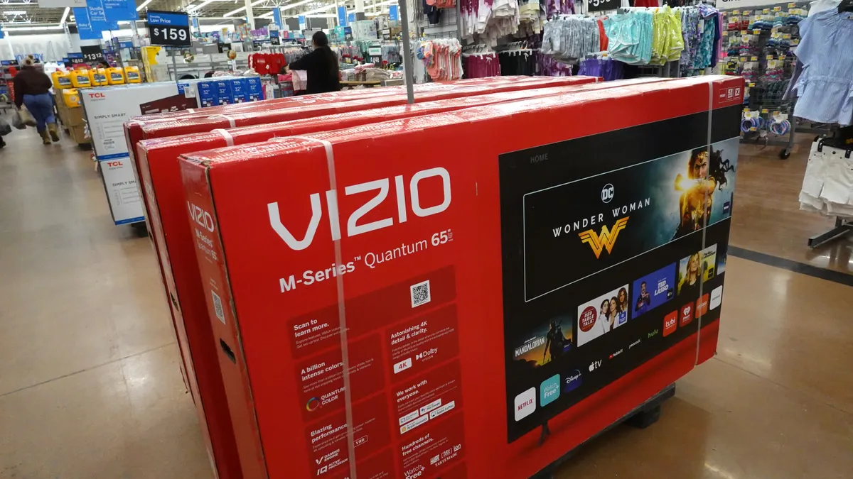
The color red demands attention because the human eye is drawn toward it. It’s one of most emotion-inducing colors, which can be both positive and negative. Red is often associated with love, lust, and passion, but also with danger, aggression, and violence.
Because of its attention-drawing properties and its ability to induce excitement, red is a popular color for company logos. Some of the world’s biggest brands — Target, Coca-Cola, McDonalds, and Kellogg’s — use red in their branding. As Pajari put it, “Red nails it.”
2. Green
Green is most heavily associated with nature. That obvious association comes from its abundance in trees, plants, grasses, and other living things.
In recent years, the color green has become synonymous with the environmental preservation movement. Brands looking to associate themselves as “being green” will use the color in their branding to connote their environmental friendliness or an overall association with being outdoors. Among them: Whole Foods, John Deere, and Land Rover.
3. Yellow
Because the human eye processes yellow first, it’s the most visible color of the spectrum. This makes it popular among brands wanting to draw attention to their logo — or at least part of it. Pajari points out that in recent years, the color has also become popular for fire trucks, rather than the traditional red, because eyes recognize it quicker.
Yellow is a popular color for fast-food restaurants because, as Pajari explained, they want to draw drivers in. A yellow fast-food sign is easy to spot and feels enticing. Probably because of its association with sunshine, yellow has also come to represent happiness — especially in American culture. For that reason, it’s popular with several service brands, like Sprint, Best Buy, and Ikea.
4. Orange
Orange is similar to yellow on the spectrum and is one of the most visible colors to the human eye. For that reason, orange is often used for things like traffic signs and hunting vests to help them stand out from their surroundings.
Due to its bold nature, the color can represent action, adventure, and vitality, making it popular among brands that want to portray an image of excitement.. According to Pajari, brands that use orange — like Harley-Davidson, Hooters, and Nickelodeon — are “betting you will think of them as engaging, friendly, and adventurous.”
5. Black
Pajari may have described using black in branding and marketing in the most perfect way, “Think of that little black dress. It goes with everything, right?” Black is utilized often as a contrast color to make other colors pop. Amazon and Harley-Davidson, for example use black as a way to emphasize the yellow and orange, respectively, in their branding.
Used on its own, black has come to represent formality, simplicity, elegance, and tradition. Many brands — including Apple, Toyota, Nike, and Honda — all use black as the staple of their logos and branding. HootSuite, as mentioned before, chose to change its Owly logo to a black-and-white scheme in order to be perceived as more mature and simple-to-use.
6. Brown
The least popular color on the list, brown isn’t always associated with pleasant things. It’s not a vibrant or bold color, so it doesn’t draw in attention like brighter colors will.
For some brands though, the dull color works. UPS, for example, uses a fair share of brown in its branding to portray that it’s dependable, practical, and trustworthy. The earthy color isn’t flashy, but it’s reliable — exactly what you want in a delivery service.
7. White
White, the color of pure light, has come to have strong symbolic meaning in human cultures. According to Pajari, the additive color theory explains that white is actually a combination of all colors in the visible spectrum. To many people, white is representative of simplicity, purity, neutrality, equality, goodness, and perfection.
Most often, white is used as a negative space for branding. Goodwill, Pajari explains, uses a white negative space in its logo to denote something that is positive. Just like black, white is often used to emphasize other colors. Perhaps the most pervasive user of white in branding is Apple. Not only is the simple Apple logo often shown in ample white negative space, but the brand is even known for producing a line of white electronics and using white packaging.
8. Blue
One of the most popular colors used in branding, blue, according to Pajari, is the color most often cited by people as their favorite. Because of its association with water and sky, blue signifies peace, calm, and trust.
Blue is a popular choice for health and financial organizations that want to demonstrate these qualities. Allstate, Metlife, GE Capital, American Express, and Bank of America all use significant amounts of blue in their branding.
Would you like to see more marketing industry news and information like this in your inbox on a daily basis? Subscribe to our Marketing Dive email newsletter! You may also want to check out Marketing Dive's look at these 4 firms show ad tech is becoming a hot investment.


