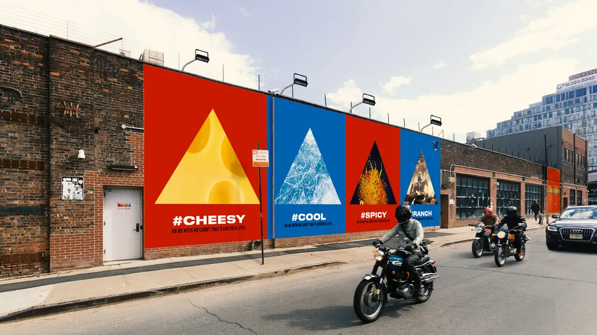
In recent years, Dunkin' dropped the word "donuts" from its moniker, Mastercard stopped spelling out its name on its logo and Doritos experimented with using nothing more than a simple triangle to identify the brand in its ads. These and other recent examples show that marketers don't have to broadcast a name to be a name brand.
While brand refreshes aren't new — Kentucky Fried Chicken became KFC years ago — a flurry of activity this year show how marketers are embracing simple brand visuals, a trend driven by digital technology, both in how consumers use connected devices and in deriving inspiration from some of the most popular tech brands.
Major tech companies, which often use short and simple brand identities, have become some of the most beloved brands. The top four most valuable brands are Apple, Google, Amazon and Microsoft, according to Interbrand's annual ranking of brand value. With Samsung holding the number six position on the list, it's clear that technology companies occupy a valuable place in the consumer imagination.
"It is a mark of a successful brand when you can drop the word marker."

DJ Stout
Principal, Pentagram
"The more traditional brands like Dunkin' are looking at these tech companies and saying, 'I want some of that cache.' They want to be Twitterable," said Brendan Murphy, senior partner, design, at global creative consultancy Lippincott. "Twitter has the bird. It is a driver in how brands are approaching identify today. Even if you do a more traditional logo type, there is a recognition that you need a shortened version."
However, any logo changes have to be embraced by consumers, which is why it is sometimes easier for a brand that people already know and love to successfully make these moves.
"It is a mark of a successful brand when you can drop the word marker," said DJ Stout, principal at design firm Pentagram. "It is a little cocky in a way: it shows a certain about of success and self assurance that everybody knows who you are."
Dunkin' tested the waters
For Dunkin', it was a gradual process to drop the word "donuts" from its name. Over the past few years, the company has been evolving into a "beverage-led, on-the-go brand," said Drayton Martin, VP of brand stewardship, at Dunkin' in emailed comments.
"The drawback is that guests' perception of Dunkin' may not reflect today's brand offerings and experience," explained Martin. "In order to signal change and invite reappraisal, the removal of Donuts from our name telegraphed there is more to Dunkin' than just donuts."
The company tested the new logo extensively, including on exterior signage at Dunkin' locations before completely rebranding. "The reality is that we have been proudly calling ourselves Dunkin' for the last 11 years with our tagline 'America runs on Dunkin'.' The answer and acceptance were right in front of us," said Martin.
"We have seen brands that have shortened their names maybe too much and then they lose meaning, and nobody actually knows what the shortening means."

Brendan Murphy
Senior partner, Lippincott
Dunkin' may have also felt that the the word "donuts" was too restrictive, particularly since coffee sales are strong while the word "donuts" could potentially have a negative association as an unhealthy treat in an increasingly health-conscious world.
"The removal of a single word allows them to retain all of the positive associations with their brand, while providing them with the ability to expand what their brand represents," said Zack Arostegui, senior brand strategist at Walker Sands, in emailed comments. "It's also highly likely that many of their customers were likely already using the shorter, simpler name which suggests familiarity and affinity — like a nickname you'd use with a close friend."
Dunkin' said internal research has shown that the change has been well received by consumers.
Is it worth the risk?
However, not every brand can get away with a truncated name.
"The Apple has meaning because of the company, not because of the logo," Stout said. "The brand is such a great company and has changed society. Same with Google. Their multicolored logo G looks pretty basic, but the company is powerful which makes that G powerful. If the company is known and respected, then they can get away with this kind of identity."
There is a danger that if a brand shortens its identity too much it will not be identifiable. Some brands have just added confusion by shortening their name. Gatorade, for instance, introduced packaging with just a G but, it confused consumers and they had to do an ad explaining the move.
"We have seen brands that have shortened their names maybe too much and then they lose meaning, and nobody actually knows what the shortening means," said Murphy. "Weight Watchers went to WW on Twitter, but had to explain because people didn't know if it was World Wildlife Fund or what. It wasn't in the consumer vernacular. No consumers were shortening the name to WW. It was a misunderstanding of the market by the brand to migrate their consumer along in that conversation and in that story."
Brands are often reluctant to revamp their logos since consumers are notorious for not liking change. However, sometimes taking a chance can pay off. When Starbucks removed the "Starbucks Coffee" name from its logo in 2011, it caused an uproar among loyalists but may have strengthened the brand in the long term.
"Despite [the consumer backlash], it was ultimately a smart strategic shift," said Arostegui. "The Starbucks siren had been with the brand for 40 years and is a very distinct and recognized mark in the space. The move gave Starbucks the flexibility to expand to offerings beyond coffee, and has elevated the siren to a ubiquitous presence, recognizable from afar on every block."
For a brand like Mastercard, whose iconic red and gold circles have been around for decades, a more simplified identity appears to be working. Since the company dropped its name from its branding earlier this year, the company boosted its brand value on Interbrand's annual ranking by 25% over the prior year, moving up to No. 62 from No. 70 last year. This suggests years of investing in branding has paid off with enough recognition to support such a change.
Making logos more digestible on mobile
Mobile consumption could also be a reason that brands are shortening their names, as limited screen size requires a brand to get a message across within specific constraints. Contemporary audiences spending significant amounts of time on their mobile phones, meaning engagements are increasingly driven by the visual vernacular popular on the channel. Emojis, Snapchat and Instagram have risen in popularity uniting people around the globe in one universal succinct language.
"The emojis and buttons on our phone are basically symbols and people are using these emojis more and more just for communication," says Stout. "If I want to say, 'Yes, good idea,' I just hit thumbs up. We can present ourselves just with a symbol and there is sort of a purity to it. We don't need the words to yell at you and make it feel like advertising."
Mobile also has transformed the way that people consume content, with people opting for quick glances over deep reads. Brands are changing their logos to adapt to how people are talking about them in real life.
"As a society we have become more scanners than readers," said Murphy. "We are glancing at multiple screens at once to wet our appetite for something to read and we want the immediacy of something simplified."


