Dive Brief:
- Manischewitz is rebranding to extend its appeal beyond the kosher aisle to mainstream audiences, according to details shared with Marketing Dive.
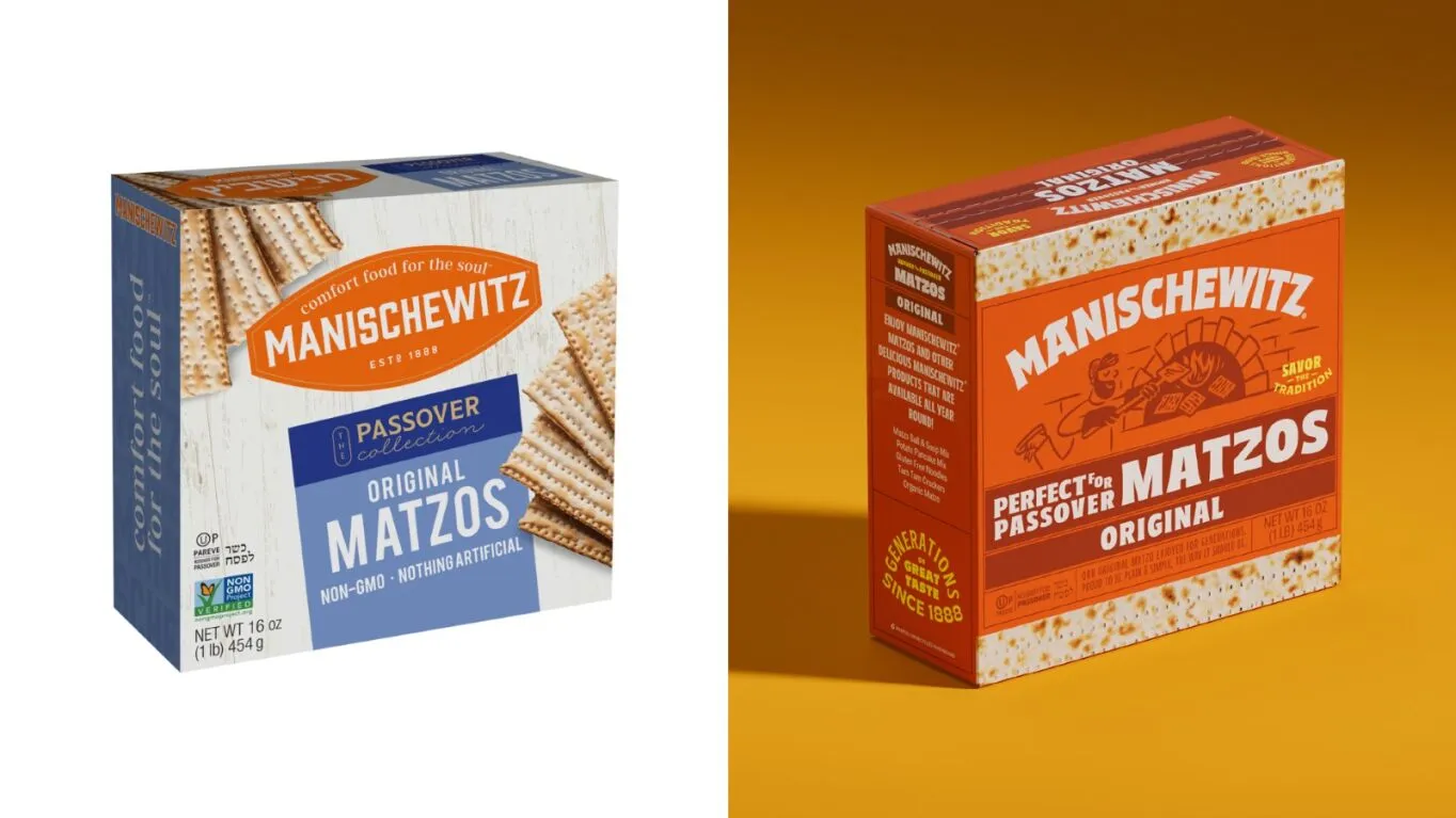
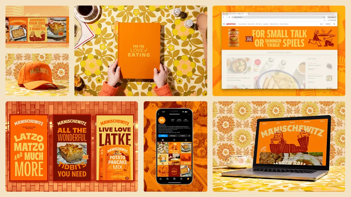
- The over 130-year-old purveyor of matzo ball soup and latkes has a new look and logo, complemented by a warmer color palette of reddish orange, yellow and brown. Illustrations inspired by New Yorker cartoons pepper packaging and marketing materials while products include phonetic spellings of Yiddish food terms.
- The brand worked with agency Jones Knowles Ritchie (JKR) on an overhaul that capitalizes on the embrace of a wider, more diverse range of cuisines among U.S. consumers. Manischewitz will release new offerings in time for Passover and has launched an ad campaign promoting the changes ahead of the key holiday sales period.
Dive Insight:
Manischewitz is well-known for its kosher food offerings in the U.S. but wants to welcome more non-Jewish shoppers into the fold with its makeover and an accompanying ad campaign spanning social, digital and out-of-home. At the same time, Manischewitz is angling to win over younger Jewish consumers who might perceive the over-century-old marketer as too fusty, joining a raft of packaged foods brands that have shaken things up to court favor with fickle Gen Z and millennial buyers.
“In an effort to update the cultural relevancy with a younger Jewish audience as well as mainstream culturally curious audience, we have refreshed our brand with an exciting new look and feel on our current and new product offerings,” said Shani Seidman, CMO of Kayco, Manischewitz’s parent company, in a statement.
Kayco, a kosher food distributor, acquired The Manischewitz Company in 2019, the latest in a series of ownership changes over the company’s long history.

The refresh debuting ahead of Passover, a major sales occasion, positions Manischewitz products as a gateway for curious consumers to learn more about Jewish culture and culinary traditions. Phonetic spellings of Yiddish phrases, such as “Luck-shen” for egg noodles, serve to educate buyers while a warmer color palette, logo and other visual elements aim to be more inviting. Manischewitz’s website is also selling merchandise like a schlep tote bag and “Man I Shvitz” tank top.
Manischewitz collaborated with Jewish photographer Yechiel Orgel to enliven recipes and other visual elements. In addition, the brand is embracing a “verbal identity” based around three cultural touchstones: an outspoken bubby, or grandmother, comedian Jerry Seinfeld and a passionate foodie.
Manischewitz worked with JKR on the effort, enlisting an agency that has helped mass-market CPGs such as M&M’s, Kraft Heinz and Minute Maid reinvent their offerings with a more modern, inclusive edge. JKR recently led a rebrand for Impossible Foods that looks to lure more meat eaters to plant-based alternatives. JKR conducted consumer and expert interviews, visited Manischewitz’s headquarters and drew on the brand’s archives to inform its approach.


