The following is a guest post by Lucas Murray, music producer at sonic branding agency Made Music Studio. Opinions are the author's own.
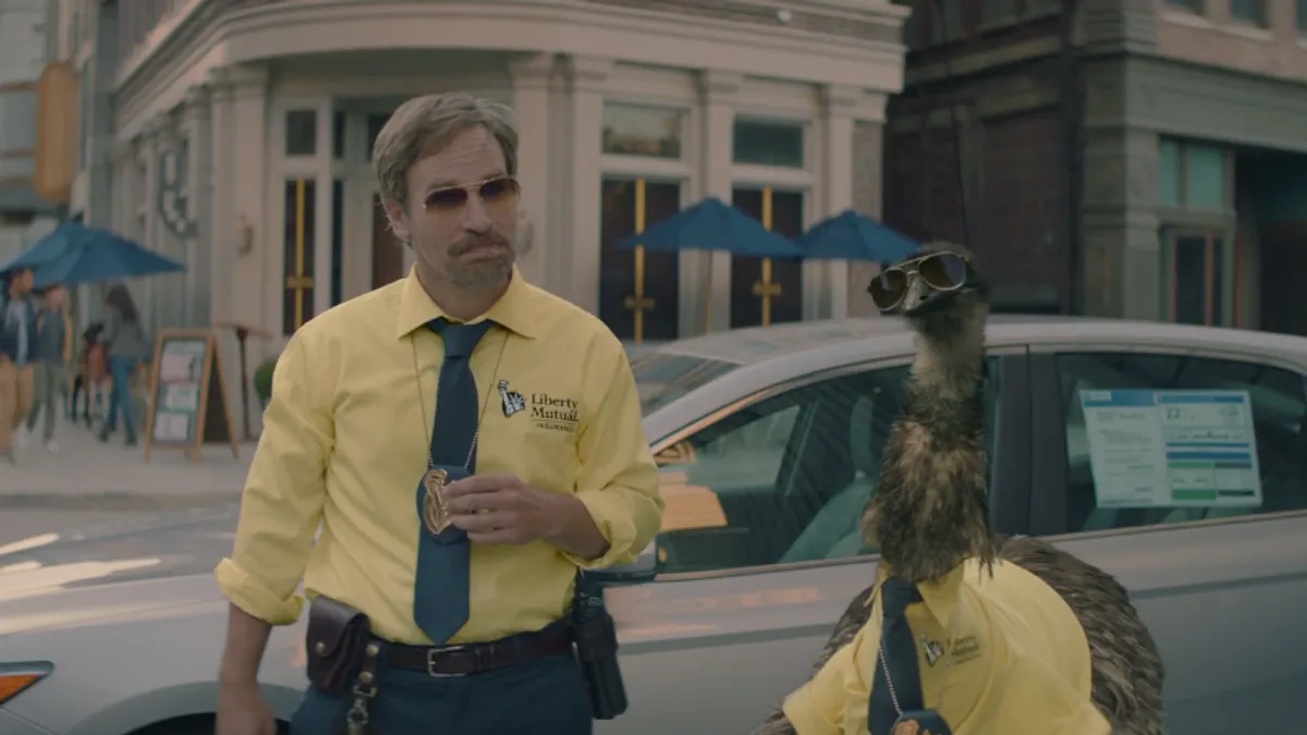
"Liberty, Liberty, Liiiberty… Liiiberty!" I was watching a Brooklyn Nets game recently on TV and on every commercial break, I was bombarded with the effervescent Liberty chorus singing that repetitive ditty. I'm sure you can hear it in your head now, and you may even be tempted to sing it out loud. Go ahead, no one's listening.
While the Liberty sonic logo may sound like a second thought of a summer camp singalong, it was designed with some very clear objectives in mind. In fact, every successful sonic logo was created with intelligence, artfulness and purpose. Some companies know this and elegantly bring their brand to life through sound and music. Some companies do not, and either create an uninspired audio cue mismatched to their brand or never think to create a sonic identity at all. What is clear is that the gulf between these two types of brands is growing wider and wider as audio-first mediums, apps and experiences continue to rise in popularity. The simple fact is that if you want to reach into people's brains, hearts and pocketbooks in 2021, you must have a strong, well-designed audio presence.
As a music producer at a global sonic branding studio, I want to give you a little peek behind the curtain and show you some of the tricks of the sonic branding trade. So if you find yourself helping to create your company's fancy new sonic identity down the road, you'll have some tools at your disposal. Let's see if we can learn some things from brands that are doing it well.
There's no better place to start than with perhaps the most recognizable sonic logo of all time: "Ba da ba ba ba!" The operating principle McDonald's used when creating this logo was to use the most universal elements in music. For instance, those five notes are the exact notes of the pentatonic scale, which is the only musical scale that can be found in almost every musical tradition all around the world. Notice, too, that the main expression of the logo is made of syllables that almost anyone, at any age can say. The logo also uses syncopation in the melody. For non-music students, syncopation means pushing notes to the off-beat, and its consistent effect is to make you want to move to music. In fact, it is the rhythmic underpinning of almost all dance music.
In sum, this logo was designed for anyone in the world to understand it, enjoy it and replicate it. This has allowed McDonald's to create countless variations of its sonic logo, expressing it over the years as a hair metal band, a whistle, an EDM track, a traditional Chinese ensemble and many more. Each variation sounds natural because they contain universal elements.
HBO uses a different strategy for their sonic logo, but is no less successful. Instead of leaning into musical elements, HBO leads with non-musical sound that directly calls the product to mind. The logo begins with the sound of analog television static, reminding any listener of the act of watching TV. Yet if HBO had stopped at simply the white noise of TV static, I would not be writing about it right now. What makes this sound so effective is that HBO calls the product to mind in an enhanced, hyper-real, unique way. The static seamlessly morphs into a reverent choir singing "aaaaah" and is supported by a low analog synth. They are not demonstrating the literal experience of watching HBO; they are telling the emotional story. In five short seconds, HBO takes the very grounded activity of watching television and elevates it into something sublime.
Finally, I want to return to the example of Liberty, the new kid on the sonic-branding block. Love it or hate it, you have to take notice of it. The Liberty sonic logo works in the way that a high school kid's jokes work: funny the first few times, then not funny as they proceed to overuse it, but then funny again around about the 73rd time. This too is by design. Liberty's sonic logo uses humor and repetition to its advantage. Built into the structure of the logo is a joyfully absurd repetition. The first three "Liberties" create a predictably complete musical phrase, resolving to musical finality on the last, low note. There is no musical reason for the fourth "Liberty" — and yet… "Liiiiiberty!"
It is funny! And Liberty Mutual is in on the joke. It is both parodying old-school jingles and reaping its stylistic benefit. They get to say their name four times while maintaining cultural credibility because the brand is seemingly not taking itself too seriously.
Although they have three very different approaches, each of the brands mentioned here have one crucial thing in common: Their sonic logos match their brand goals. McDonald's harnesses universally appealing musical elements to communicate joy to a worldwide audience. HBO calls its product to mind in an emotional way to draw viewers into the experience. Liberty uses humor and repetition so we remember the name.
And yet, as successful as these three creative strategies have been, I am certain your brand will need something different. You have a unique brand, so your goal shouldn't be to merely copy other good examples of sonic branding. Instead, learn from those who have done it well, borrow the ideas you need and create your own unique path to an iconic and enduring sonic logo.

