Dive Brief:
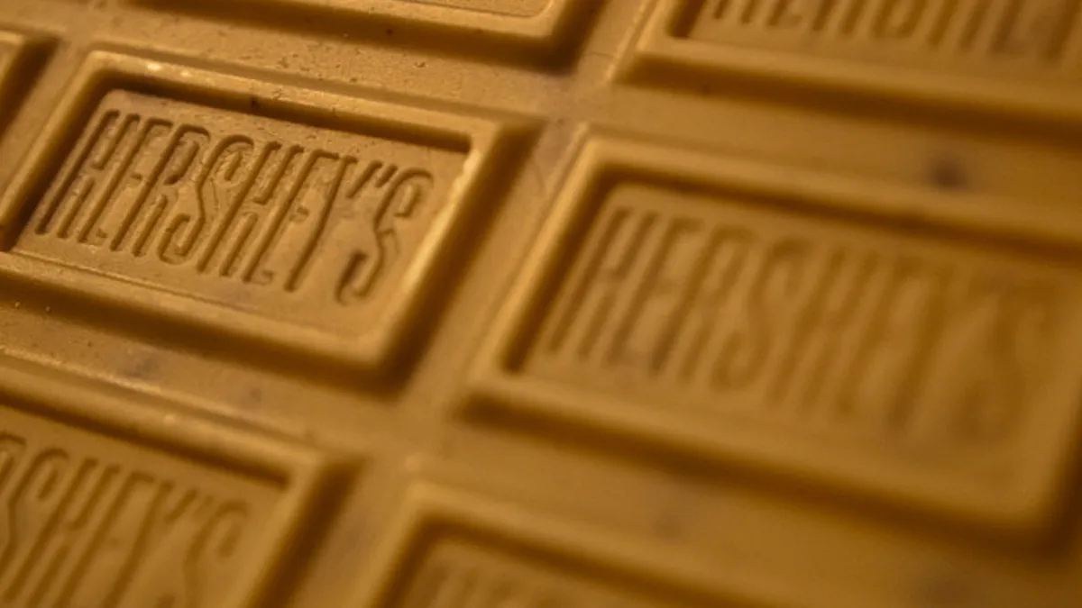
- The Hershey's Company revealed a new logo as part of efforts to move away from just being recognized for chocolate bars.
- The new logo is flatter and simpler than the previous 3D styling and includes a new logo of a 2D Hershey's Kiss.
- Quickly, social media recognized the new logo's resemblance to a popular emoji—one that the brand certainly didn't intend to emulate.
Hershey’s hires a design firm to design a brand new steaming pile of poo. http://t.co/lkTC35txKd pic.twitter.com/uqgOMsrfnb
— Jared Spool (@jmspool) August 28, 2014
Wow, @hersheys are really going for accuracy with their new logo! http://t.co/sH6NJMkzry pic.twitter.com/yB126vKm3i
— Chocablog (@chocablog) August 30, 2014
Dive Insight:
This snafu is just another example of rebranding gone unexpectedly wrong. When undergoing a big project like a new logo, it's easy for marketing teams to have blinders on to outside forces —which includes emojis. The Internet can be a great check and balance system for marketers, as we have seen with other controversial logo changes like Airbnb.


