Campaign Trail is our analysis of some of the best and worst new creative efforts from the marketing world. View past columns in the archives here.
As entertainment content blurs the lines of traditional genres and bends across digital platforms, WarnerMedia looked to rethink its properties as categorized by the tone or feeling consumers perceive when viewing. For TBS, the company's top comedy network, that meant repositioning it as a genre-fluid, taste-driven destination. But before WarnerMedia and its agency Trollbäck+Company could begin delivering that revamped visual identity to viewers' screens this week, the team had to first define the brand's essence and create a design system to fit.
That creative process for this nontraditional rebrand kicked off with Trollbäck redesigning TBS' office space to reflect the brand's vibes from the inside out and get employee buy-in.
"So often clients see their brand on a screen, making them think about it only on a screen. But if you suddenly think about that brand designing a T-shirt or a mural, it helps you think about your brand in a holistic way," Bo Bishop, Trollbäck's executive director of creative strategy, told Marketing Dive.
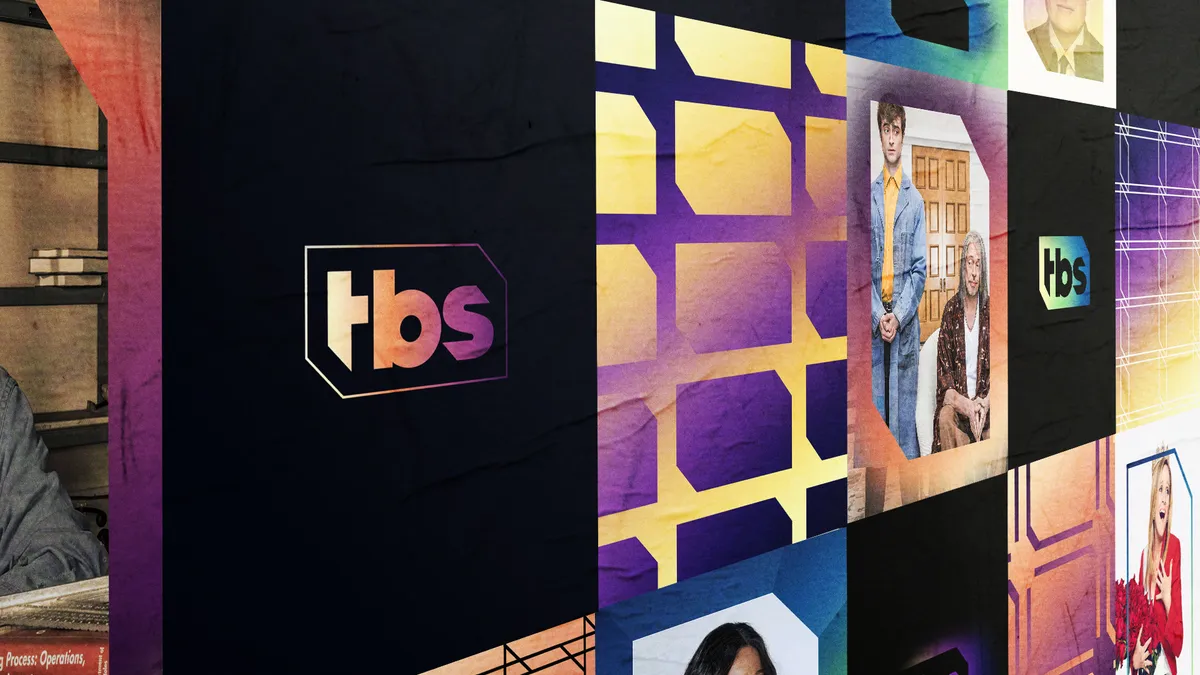
The final result of these efforts is a cohesive — yet flexible — design system that can evolve and be iterated upon for years while keeping TBS' core visual identity consistent across cable, digital, mobile and out-of-home (OOH) marketing channels. There's also a toolkit meant to empower TBS employees to be better brand builders, Bishop said, featuring a new logo that retains TBS' classic "hex" shape, marketing assets and daytime TV spots to introduce the fresh look to viewers.
"We believe that a lot of brand transformation is philosophical. If you convince people to think about the brand differently and what it can be, I think it opens you up to so many more interesting, creative ideas," he added.
'An endless array of possibilities'
The agency teamed with WarnerMedia back in January 2019 to start conceptualizing TBS' visual overhaul. At the time, TBS was categorized as a comedy network and its sister brand TNT as a drama one, but the entertainment conglomerate recognized that such traditional genres can be limiting and wanted the TBS brand to shift gears to encompass "unexpected voice-driven stories" in a more cohesive visual manner.
"We believe that a lot of brand transformation is philosophical. If you convince people to think about the brand differently and what it can be, I think it opens you up to so many more interesting, creative ideas."

Bo Bishop
Trollbäck+Company, executive director of creative strategy
Trollbäck employed an "endless array of possibilities" concept to power the rebrand by stripping things down to the essentials of what makes up the TBS brand and reassembling its strategic and visual foundation. Previously, its visuals appeared fragmented across channels or incongruent with its genre-blurring content.
"It's always a battle between having a very consistent, focused brand identity and having enough elements to support the entire array of content they have," Bishop said. "The most interesting thing to me about finding their brand essence is nothing you can see or hear, but the ebb and flow of how it actually came to life."
Starting the creative process by revamping the office space allowed Trollbäck and WarnerMedia to test the feel of TBS' new look and feel before ever developing on-air elements for viewers.
"The philosophy behind it for us is that they're living and breathing the culture of the company, which empowers them to be more powerful creators and better brand builders," Bishop said.
The concept follows an adjacent trend of recent years where employers are beginning to realize the power of transforming workers into brand ambassadors who can nurture deeper, more authentic connections with consumers.
New signage for TBS' cafeteria, restrooms and other spaces was designed to embody the brand and physically surround employees with the cohesive aesthetic that Trollbäck built.
Deconstructing the anchor element
Since 2015, TBS' logo formed a "hex" shape, which served as the jumping off point for the network's visual rebrand this year, according to Trollbäck's Design Director Nadia Husain.
"It's that shape that feels so TBS, and it had the potential to be recognizable and vulnerable on its own," she told Marketing Dive. "It can change shape and be used as a framing device, but it's also a form of expression and can stretch and morph depending on what platform you're on and what tone of content you have."
Designing an anchor visual element that's elastic allows a brand to support its range of content or marketing creative while maintaining a consistent brand feel that consumers can recognize across channels. It gives marketers more flexibility when developing future campaigns that retain a brand's fundamental DNA, according to Bishop.
"As content travels across platforms, how does the brand travel with it and get the attribution? I think using the logo shape as a framing device was such an intuitive idea for us because it feels organic and doesn't step on content and get in the way," he said.


