Campaign Trail is our analysis of some of the best and worst new creative efforts from the marketing world. View past columns in the archives here.
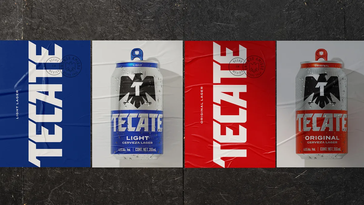
Tecate has steadily reinvented its brand over the past five years, working to depart from its trademark machismo messaging and take on a more progressive marketing approach that highlights heritage. Beginning this month, it has a fresh look to match. A simplified logo, modern advertising assets and new packaging make up the Heineken-owned beer's updated design system meant to embody Tecate's evolving attitude.
But how much can a brand change without alienating its loyal customers? For the Mexican brew and its design agency Elmwood New York, the answer boiled down to stripping away extraneous visuals to let only the most distinctive elements shine.
"If you hold onto the iconic assets, the things people automatically think of when they think of Tecate, then you're not moving too far away from the brand," Elmwood's Executive Creative Director Meg Beckum said. "Elevate only the things people really have a lot of love for and that will free you up to be more experimental and expressive."
The creative process began with sifting through years of Tecate's assets and identifying those that have stood the test of time. Its black eagle and quirky typography had to stay, according to Beckum, and were redrawn with simplicity in mind. After defining the brand's essence, the team could create a broader design system to fit.
Cultural immersion
Though publicly announced on Sept. 17, Tecate's modernization quietly debuted this summer in its key market of Mexico. Updated packaging is gradually rolling out to stores across Mexico and the U.S., and the broader brand refresh will expand around the world in the coming months. This includes everything from music festival and soccer sponsorships to point-of-sale at retailers, out-of-home (OOH) ads, social media activations and swag, such as coasters in bars and other ephemera associated with beer.
But before Tecate and its agencies Elmwood and Nomades could begin delivering the revamped visual identity, the team realized it needed to travel to Mexico to more deeply grasp Tecate's rich heritage.
"For our work to be authentic and to really create some meaningful change for [Tecate], we knew we had to get a good understanding of beer culture in Mexico, which is quite different than in the States," Beckum said.
This boots-on-the-ground immersion strategy revealed several key differences in beer consumption and brand perception across the region, she said. For one, Tecate is well known near the country's northern border, where the beer brand was established, but becomes less so as one travels south.
"The cities in the north, especially Monterrey, are painted with Tecate symbology. Huge eagles and the wordmark are plastered around the city on bodegas and bars," Beckum said.
Down south, the brew is less iconic and faces significantly more competition in metropolitan areas like Mexico City. Beer in that region is often sold individually — rather than a 6-pack or case, as typical in the U.S. — in cluttered bodegas offering a variety of snacks and drinks. Unable to rely on cardboard cartons to translate the brand, a can's packaging must be designed to stand out and stand on its own.
On top of that, light beers like Tecate are often consumed in Mexico as a refreshment for folks living in the hot climate, and less so to become intoxicated, according to Beckum. There's a significant social aspect to the brand, with many consumers drinking it outside a bodega with friends, at a boxing match or as part of music festivals.
Learning these key differences in consumption and brand perception informed the agencies' creative approach to redesigning Tecate's visual identity, she said. Knowing how the brand was already embedded in parts of Mexican culture — from murals at soccer stadiums to outdoor entertainment venues — helped Elmwood and Nomades understand that a visual refresh would require developing a design system that translates across digital, social, OOH and beyond.
"Tecate shows up everywhere in Mexico. That forced us to think beyond packaging and consider how to visually flex the most fundamental pieces of the brand while keeping them consistent but flexible for different channels," Beckum said.
Constant evolution as part of brand building
The new global look follows years of Tecate and its agency partners working to modernize the brand. Most recently, it introduced a brand positioning in February that targeted Mexican Americans. The U.S.-focused campaign, entitled "Mexico is in Us," aimed to court a more eclectic set of drinkers who are passionate about their bicultural identity, executives said at the time. Spotlighting the label's Mexican-American heritage showcased Tecate's continued evolution away from a past approach that hinged on masculinity.
"The days are gone where you could rebrand and be done for five years. Brands are now expected to stay up-to-date all the time."

Meg Beckum
Elmwood NY, executive creative director
Tecate joins a number of male-oriented brands marketing a progressive vision of what defines manhood. Procter & Gamble's Gillette, direct-to-consumer razor brand Harry's and others have in recent years introduced campaigns designed to appeal to a younger, more diverse and progressive consumer base.
This move toward more modern messaging across categories arrives as countless brands refresh their visual identities. Tecate, Heinz, Keebler, Bumble Bee Seafood, J.M. Smucker and others are employing a back-to-basics strategy designed to unify packaging, logos and messaging with a cohesive look consumers can recognize.
Though there's been an uptick in refreshes this year, 2020 isn't special, according to Beckum. Brands historically revamped their look every five to 10 years, but that rigid cycle is no longer appropriate amid the increasingly competitive landscape.
"The days are gone where you could rebrand and be done for five years. Brands are now expected to stay up-to-date all the time," Beckum said. "I think we'll see less full-blown refreshes, but more constant evolutions to stay iconic and relevant with new markets and audiences. That sort of behavior is going to be part of the brand-building process now."


