Campaign Trail is our analysis of some of the best and worst new creative efforts from the marketing world. View past columns in the archives here.
Last year brought a number of notable brand refreshes, and the first six weeks of 2021 appear to be progressing in much the same way. Following General Motors, Burger King and Kia all modernizing their looks last month, Jimmy John's became the latest to unveil a new visual brand identity, one that also includes a comprehensive toolkit designed specifically for the digital age.
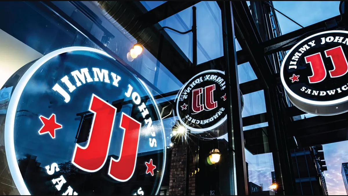
The fresh look encompasses a simplified and modernized logo — composed from Jimmy John's 47 logo variations used since 1983 — along with custom typography, hand-drawn quirky illustrations and colors that pop on screens.
The sandwich shop's refresh was introduced to the world this week on advertising's biggest stage, the Super Bowl, with a commercial featuring fictional meat boss Tony Bolognavich, a self-proclaimed "king of cold cuts." The national 30-second spot was Jimmy John's big game debut and marked a significant shift in the brand's strategy toward modernization, while promoting its first proper limited-time offer of Smokin' Kickin' Chicken.
Jimmy John's frequently relies on its motto of "freaky fast" delivery and has also underscored "freaky fresh" ingredients in past marketing. But that narrative still wasn’t fully coming through, according to Ryan Brazelton, executive creative director at agency ChangeUp, which developed the chain's new brand identity.
"Jimmy John's had spent so much time building equity in 'freaky fast.' There was this feeling of 'sure would be nice if customers knew, really knew, and understood our quality story,'" Brazelton said. "Value and quality are the toughest things because you can't communicate them. Words only mean so much — you have to be those words."
Adjusting to digital
The new look arrives in Jimmy John's second year under the ownership of Inspire Brands, which acquired the sandwich chain in October 2019 for an undisclosed amount, and named Darin Dugan as chief marketing officer in March 2020. Three months after the acquisition that made Inspire Brands the fourth-largest restaurant company in the U.S., agency ChangeUp came on to modernize the brand, which commands more than 2,800 sandwich shops in the U.S.
Though ChangeUp didn't initially plan for the refresh's unveiling to occur at the Super Bowl, the bigger stage could help Jimmy John's keep up with rival delivery shops that have seen increased attention during the pandemic.
"There's a whole new engine driving growth for Jimmy John's now," Brazelton said.
Understanding how much change loyal customers and long-term employees could accept was key to shaping the roadmap for the broader rebrand, which will bring forth new sandwich wraps, chip packaging and marketing assets. A redesigned look required sifting through nearly three decades of Jimmy John's heritage to strip things down to only the most iconic, core visuals of the sandwich brand, according to Brazelton.
"It had good bones and strong DNA" he said. "We pared it down to their most precious symbol, which was the JJ initials."
A lot of consideration went into what would be included in the logo — or medallion, in Jimmy John's terms — and how to simplify it for the digital age while keeping it visually appealing and true to the brand. ChangeUp's team hand drew all the words and symbols and adjusted the brand's classic red coloring to pop on smartphones.
"It's a simple change, but a pretty monumental move when you think about it at scale," Brazelton said.
Focused on fast
For years, Jimmy John's has leaned into the concept of selling fast, with marketing messages promising quick service in stores and speedy delivery to customers' homes, backing that up with the necessary delivery infrastructure. The chain’s idea was ahead of its time in knowing where the quick-service restaurant market would go, and that quick delivery would become so important for success during the pandemic, according to Brazelton.
"Value and quality are the toughest things because you can't communicate them. Words only mean so much — you have to be those words."

Ryan Brazelton
Executive creative director, ChangeUp
"We thought about, 'how would Ferrari, which is a fast-looking car just sitting there, light a sandwich?' That helped us to unlock some new ideas about what's authentic to Jimmy John's," he said. "I think that while [it] always talked about 'freaky fast,' [it] had stopped fighting the good fight on quality."
Though quality ingredients and care in preparation had always been embedded in Jimmy John's practices, quality was something that had fallen to the wayside when it came to messaging to consumers. The chain's Super Seal, an adhesive seal applied to the wrapping on sandwiches that also serves as a visual branding element, was saved from retirement during the latest refresh to remind customers of its quality proposition.
"A seal naturally at its core is a mark of quality. The Super Seal is the seal of seals. As silly as that sounds, that's OK," said Brazelton. "In the sandwich world, Jimmy John's has got some attitude and some swagger. It doesn't take itself too seriously."


