Campaign Trail is our analysis of some of the best and worst new creative efforts from the marketing world. View past columns in the archives here.
Certain brands are forever attached to a color scheme or particular typeface. Coca-Cola, for example, over the years has linked a bright red can with white cursive script to its classic soda. Even with the text in another language, the product is universally recognizable.
While the beverage behemoth is somewhat married to the same general look for its classic soda, its logo alone possesses the brand clout and global recognition that frees up its other flavor varieties to play around with supporting actors like color and background iconography.
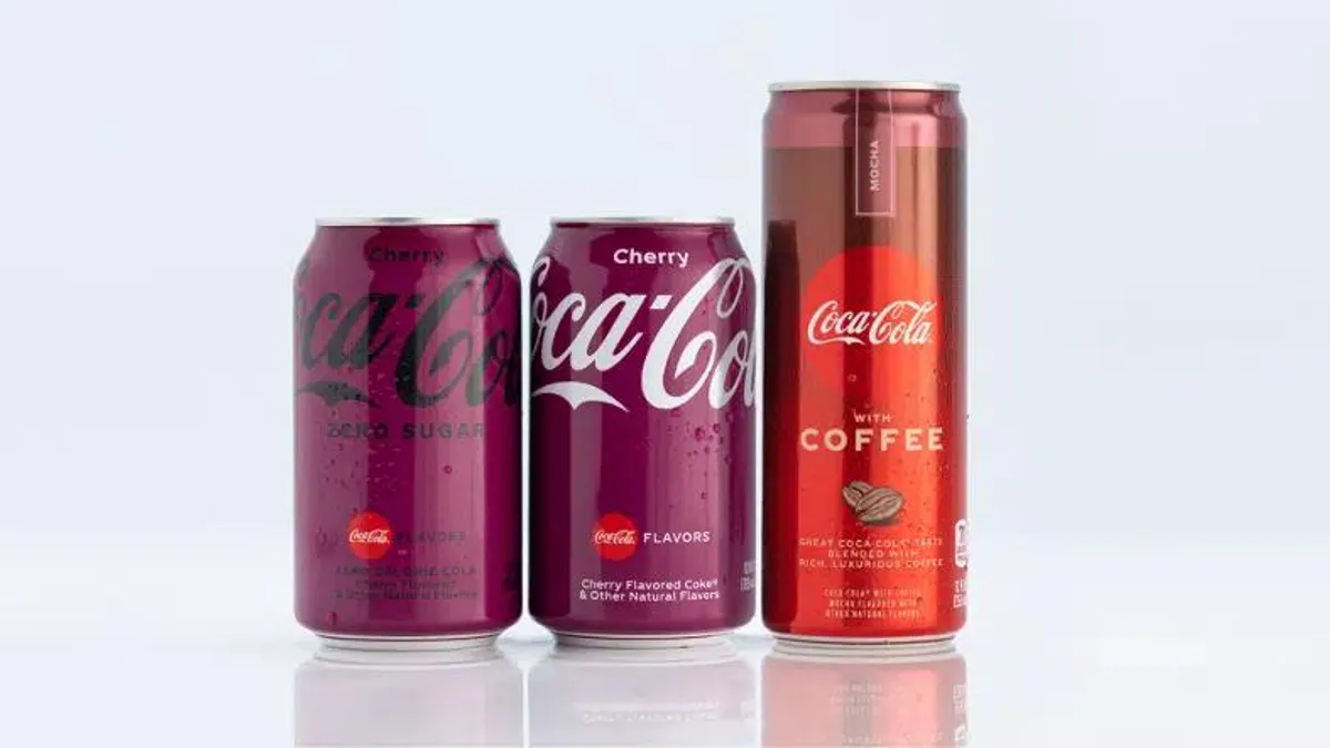
New packaging, announced on Jan. 19, leans on Coca-Cola's hero branding of its 130-year-old flowing script — front and center on the cans — while still changing up the look for its flavored products and their zero-sugar counterparts. Despite the simplified look of the richly hued cans, the beverages will still be easily recognized on store shelves.
"I think that's the acid test of whether that brand or that packaging is completing its recognition mission: Can you blur your eyes and still pick it?"

Terrance Weinzierl
Type director, Monotype
Overlaying the 19th century logo on solid-colored cans offers some balance of nostalgia and modernity, a comforting reminder of the iconic beverage brand that is Coca-Cola, according to Terrance Weinzierl, type director at Monotype.
"When I go to the store and I'm looking for Coke, you would be able to recognize these flavors from six feet away with your eyes squinted," Weinzierl said. "And I think that's the acid test of whether that brand or that packaging is completing its recognition mission: Can you blur your eyes and still pick it?"
The 'Chobani effect'
The can redesign, which will start hitting store shelves this month, builds on the beverage brand's simplified design system from April 2021 across its Coca-Cola, Coca-Cola Zero Sugar and Diet Coke products. That refresh cut extraneous visual elements and pared down the brand's overall look in what was the first global packaging redesign since 2016, when the company first instituted its "One Brand" strategy.
In its latest update, Coca-Cola is bringing some uniformity to the shelf and across its Flavors portfolio. Together, the line appears more visually consistent than in the past, to which Weinzierl recalled Cherry Coke's bright and busy packaging from the 1990s. Now, stacked colors on multiflavor beverages like Cherry and Vanilla also help to communicate what is inside the can, creating a clearer tie between packaging and product.
"When I look at the whole lineup, it reminds me of a subway map," Weinzierl said. "There's a designer named Harry Beck, who did the original London Underground map and abstracted it from a real map into this visual of just lines and dots of certain colors. It's this abstraction that makes [Coca-Cola's] whole product line easy to navigate right away."
Coca-Cola's latest refresh aligns with the broader paring down of brands' visual assets and packaging in recent years. Brand makeovers have taken on new importance in the past two years as marketers have worked to keep their brands relevant in a pandemic-altered landscape.
But just as trends in fashion occur, typographic styles ebb and flow, Weinzierl said. There has been a push in the past 10 to 20 years to abandon old script typefaces and use geometric sans serifs. Brands like Burberry, Google and Yahoo in the 2010s switched to flatter, block-style logos in a bid to reach contemporary consumers on digital channels.
"I think we are on the other side of that trend," Weinzierl said. "This also relates to what we call the 'Chobani effect.' Chobani introduced this soft serif typeface that looks retro and wholesome and human — kind of the anti-geometric sans serif. Since then, a bunch of other companies have picked up on this trend for styles that are way more human and approachable and friendly-looking, as opposed to a geometric sans serif."
Packaging as a poster
Coca-Cola isn't alone in kicking off the year with a fresh look. M&M's and Anheuser-Busch also unveiled brand refreshes in mid-January, likely laying the groundwork for realignments to brand values or broader marketing initiatives in the year ahead as they and other global brands continue to adjust to COVID-19-related hiccups or supply chain issues.
"... Packaging also must function like a miniature poster, with the right balance of information on it. If it's too dense, consumers won't read it. If there's not enough information, they might not choose it."

Terrance Weinzierl
Type director, Monotype
These types of changes to logos or packaging aren't typically enacted haphazardly — especially for massive companies like Coca-Cola. The top of the year is a natural deadline for major projects such as a logo update or packaging overhaul, signaling that Coca-Cola's new look had been in the works for months or even years, undergoing painstaking consumer research, testing, planning and rollout, per Weinzierl. And with fierce competition on store shelves, the importance of a brand's overall look stretches beyond mere appearances to impact the bottom line.
"A grocery store is a graphic design goldmine, with maybe as many typefaces as a library," Weinzierl said. "But packaging also must function like a miniature poster, with the right balance of information on it. If it's too dense, consumers won't read it. If there's not enough information, they might not choose it."


