There’s no question that a brand’s logo is one of the more identifiable and vital parts of company’s branding. For that reason, B2B brands with exceptional logos should be recognized.
Like the Nike swoosh and Apple’s bitten fruit, a good logo is simple enough to be versatile, yet uniquely recognizable. Few B2B brands have reached these companies’ similar icon status, but they are not any less brilliant.
Gathered here are eight of the best B2B logos for you to enjoy.
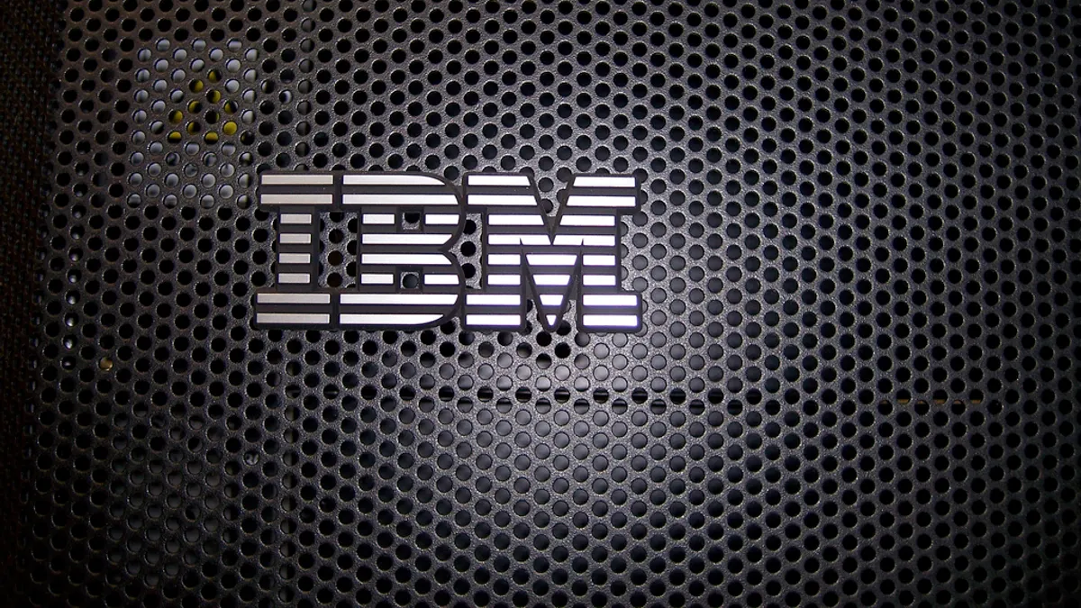
1. IBM
B2B technology giant IBM has a logo that fits into several important categories. Because it uses the company name it’s instantly recognizable while being simple enough to be used in a wide variety of mediums and striking enough to stand out against competitors.
2. GE
Most people would instantly recognize GE’s circular logo. The blank space within the circle replicates the tracks of the base of a light bulb, which was a flagship product of one of GE’s founders, Thomas Edison. Others have interpreted the white waves to represent the inside of a washing machine – another big seller for GE.
3. Cisco
Leading networking equipment manufacturer Cisco has found a way to represent their technology mindset in their logo without being too over-the-top. The side-by-side lines with varying lengths are reminiscent of measurement displays on lots of different technologies-- a great example of alluding to an object without fully replicating it.
4. AstraZeneca
Pharmaceutical company AstraZeneca is a well known brand in the health industry, but the logo doesn’t receive as much attention as it should. The maroon and yellow color scheme looks polished and unique and the yellow symbol is an interesting shape. Vaguely resembling a molecular compound, further inspection of the icon brings forth the letters A and Z.
5. LG
Korean electronics firm LG’s logo holds a variety of symbolism. Markings within the red circle resemble a human face that, according to LG, is meant to represent the brand’s devotion to humanity. LG’s website says the reason the face only has one eye is to represent the drive to achieve the “LG brand is number 1” goal. An L and a G can also be seen in these facial markings.
6. Buffer
Social media management tool Buffer has a logo that is sleek and simple while exuding a 3D feel. Negative space is arranged in such a way to make the logo seem three dimensional, and its slight resemblance to a paper sorting tray makes sense -- Buffer is a social media organizational application.
7. Uberflip
Uberflip, developer of content creation tools for marketers, has one of the friendliest logos around. Transforming the traditional umlaut in the German word ”uber” to a smiley face, the Uberflip logo might even wink at you if you visit their website and watch the upper left-hand corner. The accompanying box in the logo resembles a turned over, flipping, page.
8. Boeing
Aerospace and commercial jetliner manufacturer Boeing distinctly displays its company’s function in its logo. The illustration symbolizes movement around the earth while having features of a jet. The sky-blue words are slanted as if in fast forward motion. All parts of the logo are true to the overall Boeing brand.
Would you like to see more marketing industry news and information like this in your inbox on a daily basis? Subscribe to our Marketing Dive email newsletter! You may also want to check out Marketing Dive's look at 10 great books for B2B marketers.


