To meet the increasing demands of a digital audience, many publishers have overhauled their online presence to attract more readers and drive more advertising revenue.
The redesigns from these publishers are sleeker, easier to navigate and offer more options for content and advertising. Some even mimic the look of popular social sites like Pinterest. Time will tell if these design choices prove particularly effective, but anything with the potential to better service advertisers is worth trying.
Here are five of our favorite recent redesigns and how they impact marketers:

Like the other entries on this list, The Weather Channel’s site redesign was about more than a new look. The channel wanted to find a way to bring a wider variety of digital content to readers. You’ll find the addition of more original content sitting next to today’s temperature. The revamp also offered more options for advertisers, like this online video channel sponsored by State Farm.
The channel is also making a move to offer more localized content, which could potentially draw in more SMB advertisers.
2. SLATE

Slate has undergone a big transformation, most noticeably on its homepage. The layout is image-based and gives a nod to social site Pinterest’s styling. Even the headlines are displayed in a font art manner. Slate also did away with section headings and opted to show all headlines on the homepage, hoping that less clicking would result in readers staying on the page longer.
The new display allows the image blocks containing ads to blend into the page rather than be ignored as a sidebar eyesore. Additionally, the publisher has been experimenting with native advertising, like this spot from IBM, but the headlines are styled in a way that still feels natural to the design.

Chicago magazine performed an overhaul on both its print and online editions earlier this month. Most notably, the publication moved all of its event and restaurant listings—which used to take up the bulk of the print edition—exclusively online. This is a smart move for the monthly publication, since those listings can now be updated on a rolling basis rather than there being a cutoff for monthly submissions. The decision to focus on digital content, which also appears on mobile and tablet versions of the magazine, was part of an effort to drive more readers to the digital edition.
The online edition's new look feels more like a social media blog than a lifestyle magazine, and that is refreshing. This new look will feel natural to advertisers who have experience working with high-profile bloggers. The site is optimized for a stellar mobile experience, as well, giving advertisers the ability to reach Chicago readers on the go.
4. THE ATLANTIC

When the traditionally text-heavy publication set out to refresh its digital image, the designers took a page from the playbooks of consumer magazines like Rolling Stone and Esquire to create a more visually interesting reader experience. The mesh of traditional news coverage and a trendier consumer appearance resulted in a “serious” digital magazine you actually want to read.
The redesign allowed for more white space and integrated more photos and videos. It also makes the native advertising that The Atlantic has been experimenting with, like this from IBM, fit in a bit more seamlessly.
5. MASHABLE
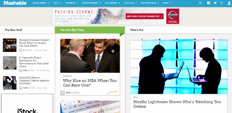
As a publication that covers social media, it makes sense that Mashable is always being revamped to keep up with digital trends. In a similar fashion to Slate, Mashable developed a look that mimics Pinterest's image blocks. Unlike Slate, however, Mashable chose to keep a banner ad at the top and to hold on to section headings.
The new look allows ads to be scattered throughout the homepage rather than exiled to one part of the screen. Advertisers will be happy to know that eyes are drawn to the ads and editorial equally.
The new site uses responsive design techniques, as well—meaning that as long as the ads are built responsively, they will display properly across different devices. The redesign is part of a bigger effort to make ads more appealing. A major component of this overhaul is to include more editorial-type advertising.
Would you like to see more marketing industry news and information like this in your inbox on a daily basis? Subscribe to our Marketing Dive email newsletter! You may also want to check out Marketing Dive's look at 10 brands employing clever logo design.

