A long list of brands took their logos in for a makeover in 2013. Some of the changes went almost unnoticed, like the subtle changes to the Facebook logo, while others, like Yahoo’s controversial logo change, dominated headlines for days.
Many brands opted to completely overhaul their existing logos. Read on to see 10 of 2013's most radical logo redesigns.
1. NIVEA
Nivea’s logo change this year came out of a need to consolidate all of the different versions that were being used. Some products were using a circle logo, while others were used a rectangle one. Going forward, all products will carry a circular blue logo meant to mimic the product's original blue tin. That blue tin has become synonymous with the brand and makes for an excellent inspiration for the new logo.

After:

2. TGI FRIDAYS
TGI Fridays has been struggling due to loss of business to local bars. In an effort to shed its old-timey image, the casual dining chain revamped its logo. The brand opted to keep the signature red stripes, but overhauled the shape and font of the logo for a fresher look. The new logo falls in line with an overhaul theme of many brand logo changes, in that it is void of any 3D elements or shininess.

After:

3. WNBA
Perhaps the most radical change on the list, the new WNBA logo is a far cry from its previous incarnation. After signing with ESPN to start airing more of its games, the WNBA debuted the new logo. The change moved away from the NBA-like red and blue design to a solid orange color scheme. The athlete in the photo is also in a dunking position, rather than a dribbling position, representing a higher level of play.

After:

4. DOW JONES
Dow Jones — part of the recently restructured Rupurt Murdoch media empire — decided to revamp its logo to help the brand advance following the News Corp/21st Century Fox split. The new logo bears little resemblance to the previous, aside from the fact that both are graphics of the words “Dow Jones.” The new logo is a black sans-serif font with a blue section mimicking the old logo's swoosh.

After:

The other half of the Murdoch media empire split, 20th Century Fox got with the times and finally became 21st Century Fox. With the new name came a new logo. The recognizable spotlight logo transformed from a fairly detailed illustration to a more streamlined abstract graphic of those spotlights. The new logo seems to better represent the modern company 21st Century Fox is looking to be.

After:

6. MOTOROLA
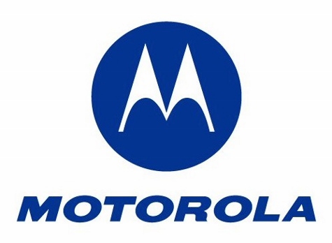
After being acquired by Google, mobile device company Motorola overhauled its logo to better represent its new parent company. The brand shed the solid colored circle and negative space “M” for a Google-like multi-colored ring around a gray M. Under font spelling “Motorola,” now all lowercase, the new logo makes sure there is no confusion, displaying the words “a Google company.”
After:

7. VH1
Music television channel VH1 has morphed into a channel providing both music videos and a host of reality shows. To reflect that variety in programming, the channel changed its logo this year to be a solid purple letter graphic with a plus sign incorporated into the H. According to a video put out by the channel, the new logo is meant to represent that VH1 is a mash-up of “music + pop culture + nostalgia.”

After:

American Airlines had reason to celebrate in 2013. Not only did the airline bring on 60 new planes — including the Boeing 777-300ER — but it also emerged from bankruptcy. To help welcome the new jets and celebrate its better financial standing, American Airlines revealed a new logo design. Completely abandoning the double A’s and eagle, the new logo is sleeker and subtly hints at the previous design.

After:

9. P&G
Since 1991, mega-brand Proctor & Gamble have been using a simple “P&G” graphic as its logo. The brand adopted this plain logo after false accusations spread in the 1980s that the company’s man-in-the-moon logo was a nod to Satanic practices. This year, P&G went back to the moon shape for its new logo despite the previous claims. This time around, however, the brand opted for just a shape that hinted at the moon rather than a clear man-in-the-moon depiction.

After:

10. RADIO SHACK
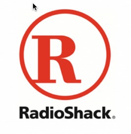
Electronics chain Radio Shack has been battling sluggish sales and an outdated image for a while. In an effort to revamp its image, the chain decided to overhaul the look of its stores — including the logo. Stores would now feature a more streamlined, rounded shape. The new design ditched the serif font for a cleaner-looking “R” inside of the familiar circle. The cleaner stores and logo are meant to evoke the retail experiences of Apple and Target.
After:

Would you like to see more marketing industry news and information like this in your inbox on a daily basis? Subscribe to our Marketing Dive email newsletter! You may also want to check out Marketing Dive's look at 6 companies fighting fraudulent traffic.

